Make Month and Year up top smaller

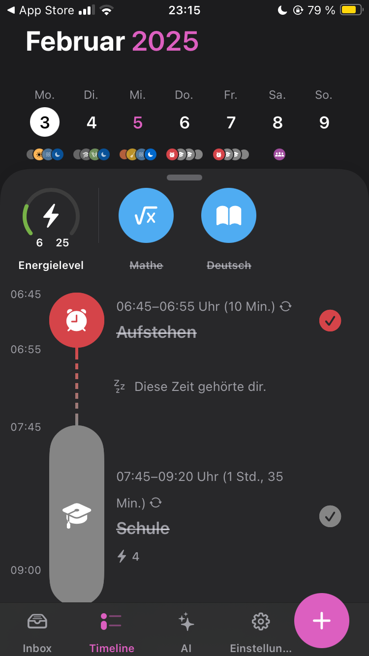
So when you open Structured, theres the Month and Year (“February 2025”) displayed up top. Before 4.0 this wasn't an issue, but now with the added tab bar it's taking up too much space. Before 4.0 you could see most of your tasks all at once, but now theres less vertical space, so you can only see a fraction. For me this takes away from the intuitive layout and I suggest making the date smaller. (Or reducing the space between the date and the days of the week)
Status: Rejected
Log in to comment and vote
No comments yet
Be the first to share your thoughts.