MacOS App Icon Change

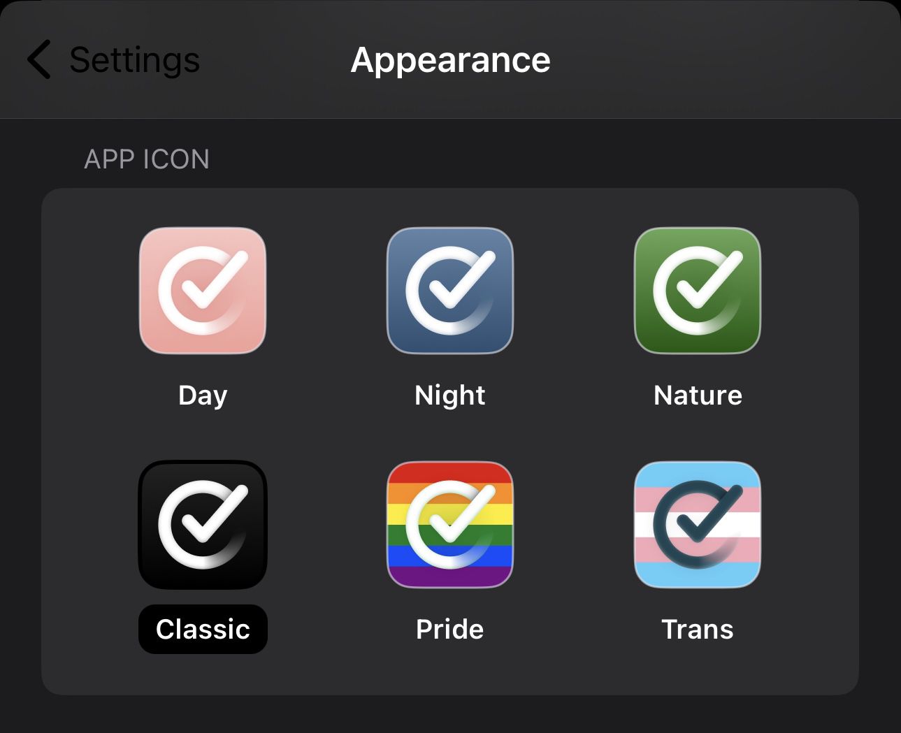
This feature is only available on the mobile (iOS) version.
Is it possible to have this feature enabled for MacOS as well?
It may be just a colour to some, but as a shy mid-twenties male user, the pastel pink app icon/notifications can get quite embarrassing... And I'm sure there are/will be a lot of fellow male users on this amazing app!
Thanks for your hard work, and this feedback application is awesome.
Log in to comment and vote
Comments13
Leo Mehlig
Feb 18, 2023
PinnedThanks for the suggestion! I am not sure why it would be embarrassing to use a pink app, but nevertheless, I hope to add this feature one day. Unfortunately, there are some technical challenges with making this available on macOS.
LindyHop
Mar 30, 2024
It's not so much the color itself, it's the lack of contrast between the pink background & the white logo--if the background were darker, it would be easier to see in the dock, regardless of color. KP's workaround above worked well for me.
TechnoTiger3000
Oct 30, 2024
Then just change the color to something less off-putting; that dull salmon is the first thing everyone I recommend the app to complains about. If someone on the team really prefers damp tones, maybe make that one an option instead.
pmconaway
May 10, 2023
Also, could you have the notification icon match the application icon color? I’ve noticed that my watch notification is still the pastel pink. For me I really can’t stand the actual shade you chose.
csaborio
Dec 8, 2023
I am 100% super gay and cannot deal with the pink icon, would love to have a preset...always associated fiery red with things that need to be done.
TechnoTiger3000
Oct 30, 2024
The app oddly avoids vibrant colors; with the new sliders, you can’t even choose basic blue, red, or yellow.
KP
Feb 25, 2024
So a work around for this is to go to your Applications folder, right click on the Structured application and select "Get Info". In the window that opens you can drag and drop this alternate icon onto the UPPER LEFT hand corner small icon in that window. Just drop it right over the existing icon. You'll know you got it when you see a little "+" symbol appear when dragging.
LindyHop
Mar 30, 2024
Thank you for this.
rjmaccarthy
Jun 6, 2024
I have the black and white icon on my ios devices, and my silly brain couldn't seem understand that the pink one on the computer was the same app and I kept forgetting to open it on there.
Then I couldn't find the icon I wanted in the correct format, so I went and made an apple ICNS file for it so it works nicely. Figured somebody else might want it too!
Download the ICNS, and drag and drop or copy and paste it into the icon spot in the "get info" window for the app!
https://drive.google.com/file/d/1L0s5Gw2HRDiGw9oCHOmUEt--8Rd8ZeVP/view?usp=sharing
Jonathan Poynter
Aug 13, 2024
I’d like to add my vote here. Salmon is an idiosyncratic colour, and more importantly - the current palette fails on WCAG standards.
https://webaim.org/resources/contrastchecker/?fcolor=FFFFFF&bcolor=E8A39C
https://webaim.org/resources/contrastchecker/?fcolor=E8A39C&bcolor=FFFFFF
And… it’s salmon.
Weston
Oct 18, 2024
Agreed. Changing manually is inconvenient, requires an icon, and reverts when an app is updated.
TechnoTiger3000
Oct 30, 2024
+ The lifeless pink continues to appear in notifications. Despite having such a great product, the app persists with a color scheme that users widely dislike for its dull tones. Why?
Philip
Mar 18, 2025
I was just about to post a similar request. I can’t stand the actual color of the icon.