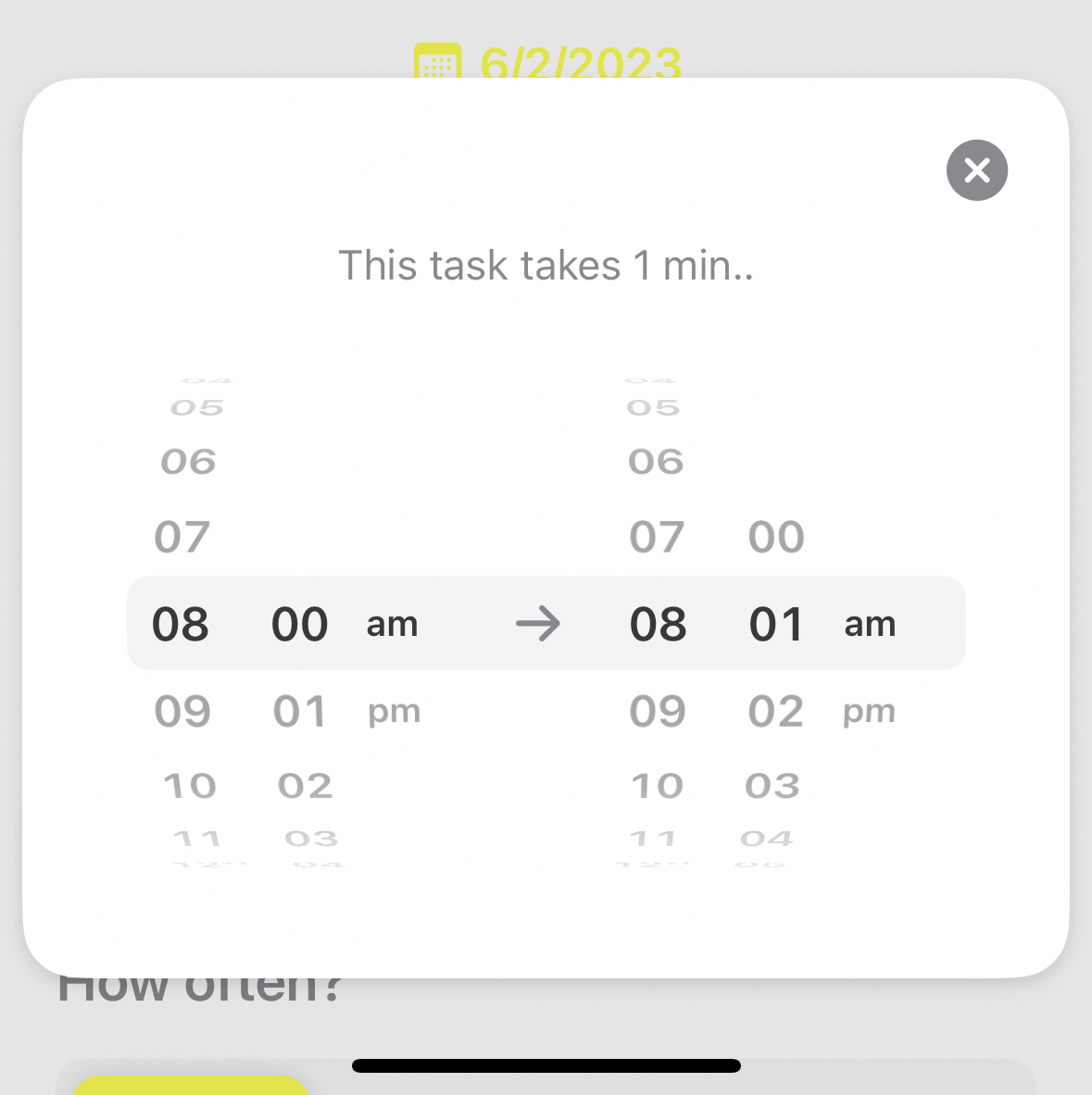
Increase size and width of scroll wheel time selector

As you can see in the time selector (8:00am➡️8:01am), it’s really quite difficult to use. If you don’t scroll in the exact spot of each hour or minute dial, it either flicks the wrong time dial or it will close out of the time selector all together reverting back to the edit task page. It had me getting quite frustrated last night when trying to schedule my workday for today. My suggestion is would it be possible to make the entire time selector bigger, wider and not as “cramped?”. Perhaps spread the hour and minute scroll wheel out a little wider so that it’s easier to individually select each hour or minute scroller without scrolling the opposite one by accident. It would be super appreciated if this could be changed. For the record, I don’t have large hands so someone with larger hands may struggle more than myself. This would also be a great way to accomodate those with accessibility needs. 😊
This request was merged into another request
Comments1
Leo Mehlig
Feb 6, 2023
This control certainly needs to be improved. Thanks for the request.