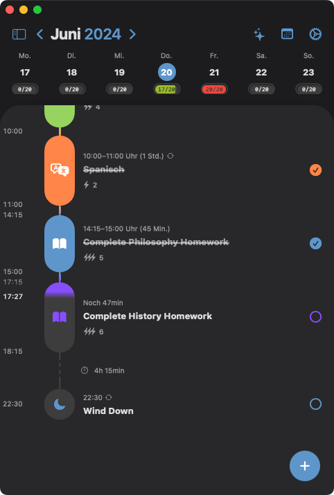
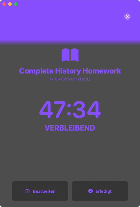
Remove gradient in current task
The gradient that shows how much time is remaining in a current task does not really fit the rest of the app's design and also makes it way more difficult to actually read the progress bar. Also IMO it seems to be a bit too harsh to look nice but making it more smooth would make the readability even worse... My vote is to change the progress bar to something with sharp edges e.g. a clipped rectangle.
Please authenticate to join the conversation.
Upvoters
Status
Rejected
Board

Structured
Date
About 2 years ago
Author
Frederik
Subscribe to post
Get notified by email when there are changes.
Upvoters
Status
Rejected
Board
Structured
Date
About 2 years ago
Author
Frederik
Subscribe to post
Get notified by email when there are changes.