Improve Color Contrast
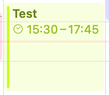
Custom colors like vibrant lime green (#CBFF1F) have poor visibility because the symbol uses that same color on a gray background. The symbol should be rendered in a darker shade placed on a, in this case, lime green (#CBFF1F)colored circle/background to ensure proper contrast and visibility (similar to Apple Calendar's approach; I’ve attached a picture of what I mean).
Please authenticate to join the conversation.
Upvoters
Status
Inbox
Board

Structured
Tags
iOS / macOS
+1
Date
8 months ago
Author

Halifax
Subscribe to post
Get notified by email when there are changes.
Upvoters
Status
Inbox
Board
Structured
Tags
iOS / macOS
+1
Date
8 months ago
Author
Halifax
Subscribe to post
Get notified by email when there are changes.