Notification Icons specific to Task Icon
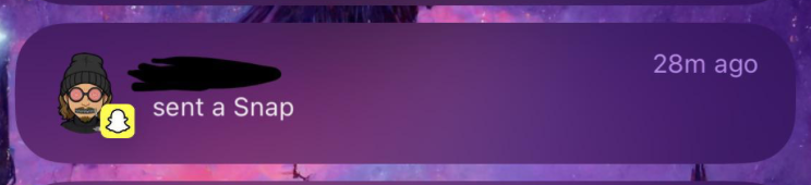
I heavily use my Notification Center in iOS and when I look at my structured notifications they all use the structured app icon in the top left. It is unappealing to look at and difficult to differentiate between them if you don’t read it. I know from other apps like snapchat there is a custom notification icon with the app icon watermarked onto it; something like that (attached) would look best.
Please authenticate to join the conversation.
Upvoters
Status
Rejected
Board
Structured
Date
Over 1 year ago
Author

dimiour
Subscribe to post
Get notified by email when there are changes.
Upvoters
Status
Rejected
Board
Structured
Date
Over 1 year ago
Author
dimiour
Subscribe to post
Get notified by email when there are changes.