Formatting & Scroll to Next Day (Mac OS)
Formatting
The Mac OS version of Structured can be confusing, and has no separation.
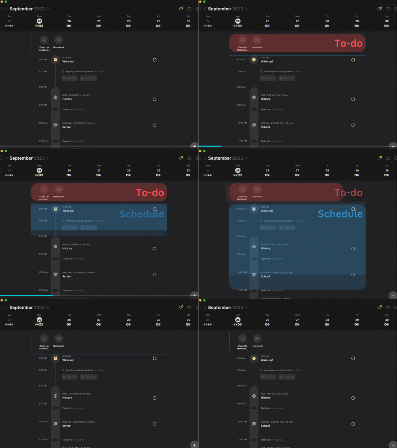
GIF of Mac OS Structured UI (School Schedule Example, To-do & Schedule Example )
The area between the "schedule" and "to-do list" is not very well defined, making it hard to differ between them.
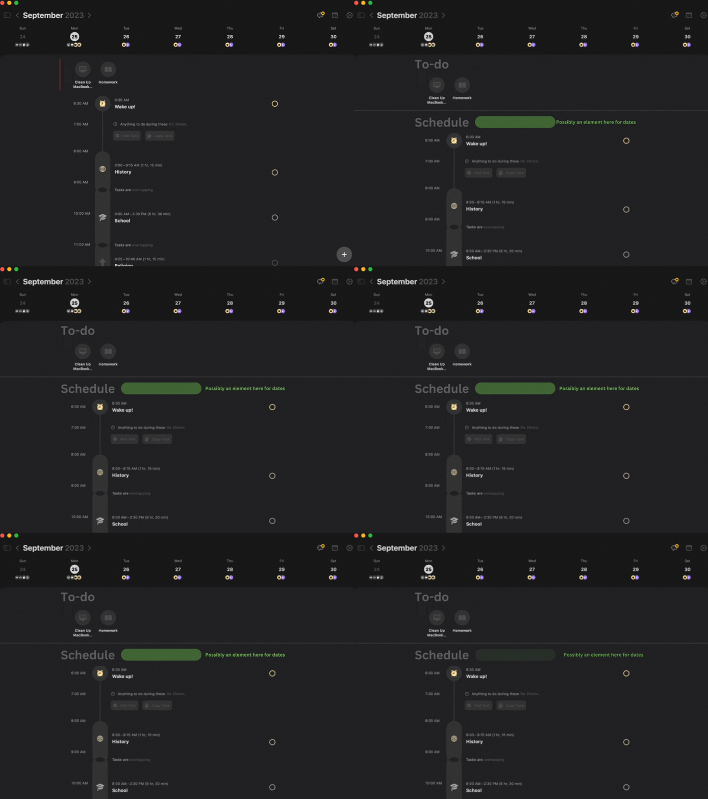
GIF of Mac OS Structure UI (New Format Example)
In this example, I place a line in-between the to-do list and schedule creating a clear separation between the two. I also add titles to make it clear what the segments are for.
Green Highlighted Area
A possible date or time segment could be placed here to indicate when the schedule is for.
Scroll Down to Next Day
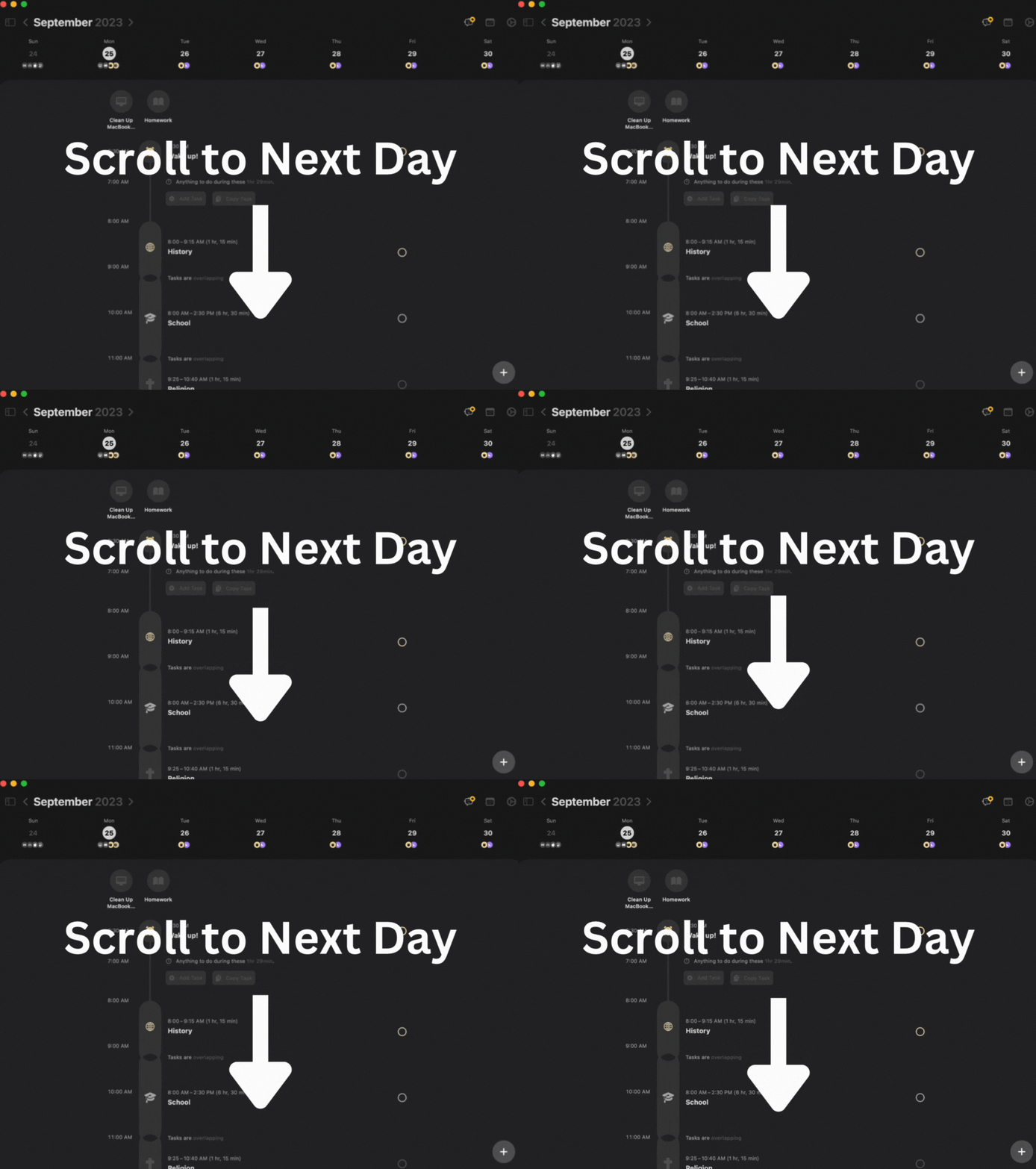
GIF of Mac OS Structured UI (Scroll to Next Day)
It would also be a cool feature to be able to scroll to the next day. You could make it so everything from the to-do list down scrolled to the next day. This is also where the green highlighted area could be useful for showing dates.
________________________________________________________________________________
Credits & Other
September 24th, 2023 -- Sunday
Formatting
_____________________________
Header 1
Header 2
Description
Body Text
Credit: Connor W.
Note:
Thank you, this is my first post and I hope it is helpful. I apologize for the bad and glitchy animations. I hope to bring more ideas to the table, and adjust my formatting. Any suggestion will help!
Topic: Formatting, & Scrolling Down to Next Day
Software: Mac OS
Improvement: Design (UI)
Please authenticate to join the conversation.
Duplicate

Structured
Over 2 years ago

Connor Wood
Subscribe to post
Get notified by email when there are changes.
Duplicate

Structured
Over 2 years ago

Connor Wood
Subscribe to post
Get notified by email when there are changes.